
Core Shifts
Some businesses sell products. Others sell services. Core Shifts provides something far less tangible, but perhaps more valuable: transformation. We created a digital identity that realised that promise, transforming deep coaching expertise into a brand experience that is clear, credible, and genuinely human.
Who is Core Shifts?
Core Shifts is a transformational coaching technique that uses organised thinking frameworks and evidence-based coaching to assist individuals and organisations achieve meaningful, long-term change. Their work extends beyond motivation and short-term breakthroughs. It aims to help people understand themselves, question long-held thought habits, and develop practical solutions for long-term personal and professional growth.
The influence of their mentoring was already affecting people's lives. The task was to ensure that their online presence reflected the same depth. Core Shifts collaborated with Ecompapi to develop a unified brand identity and digital experience that communicated their values with clarity, consistency, and confidence, making complicated ideas feel approachable while maintaining their depth.
01
The Problem
Transformational methodology. A brand that wasn't telling the story.
Some firms struggle due to a lack of knowledge. Core Shifts presented the opposite challenge.
Their coaching methodology was thoughtful, evidence-based, and focused on true behavioural change. Clients who used the approach recognised its worth. However, individuals who learned about the practice for the first time online were unable to completely comprehend the difference. The brand identity was inconsistent, the website made complicated ideas difficult to navigate, and the overall experience lacked to convey the depth, organisation, and professionalism that defined the coaching itself.
When your work is centred on trust, perception is important. Before someone commits to a coaching journey, they must be certain that they are in capable hands. Core Shifts required a digital presence that instilled confidence from the first interaction.

No Cohesive Brand Identity
Without a clear visual identity, the brand struggled to convey the professionalism, clarity, and structure that underpin its coaching philosophy.

Website Didn't Reflect the Depth of the Work
The coaching approach was advanced, but the website did not lead visitors through it in a way that was intuitive, engaging, or simple to understand.

Gap Between Expertise and Audience Perception
The coaching quality goes much beyond how it was described online, resulting in a gap between the value offered and the impression that prospective clients had.

No Foundation for Sustainable Growth
Without a cohesive brand system and a strategically structured website, long-term positioning and digital growth were based on fragmented efforts rather than a scalable foundation.
02
Goals
Authority, clarity and trust, built into every touchpoint.
Transformation is very personal. Before investing in changing their mindset, leadership, or organisation, people must first trust the people who will guide them on that journey. Every aspect of Core Shifts' digital presence had to convey confidence without becoming clinical, approachable without losing credibility. The goal wasn't just to update the brand. The goal was to build a comprehensive identity and digital ecosystem that mirrored the same clarity and structure as the coaching process itself. From the logo to the online experience, every interaction had to communicate one consistent message: significant transformation begins with understanding.
Create a Brand Identity That Communicated Authority, Clarity and Trust
Create a refined visual identity that conveyed Core Shifts' professionalism and integrity while ensuring long-term awareness across all client touchpoints.
Build a Website That Made Complex Coaching Concepts Accessible
Create a website that simplifies difficult coaching frameworks into a simple experience, allowing users to confidently understand the methodology's worth.
Establish Long-Term Positioning as a Credible, Trusted Coaching Practice
Create a scalable digital foundation that increased trust, enabled future expansion, and established Core Shifts as a reputable coaching practice for both individuals and companies.
03
Research
Understanding the methodology. Finding the themes that had to lead.
Before diving into colours, layouts, and messaging, we sought to understand what distinguished Core Shifts. We engaged ourselves in their coaching philosophy, audience needs, and transformative method to discover the themes that persisted throughout their work. Three themes stood out above everything else: clarity, depth, and purposeful transformation. Our competitor review also revealed a crowded coaching sector filled with emotional promises but no structure. The opportunity was not to be louder than everyone else. It aimed to convey thoughtful expertise in a manner that was calm, credible, and undoubtedly human.
How individuals and organisations evaluate coaching practices before committing
Choosing a coaching partner is rarely an impulsive decision. Individuals seek trust, relatability, and proof that meaningful outcomes are achievable, but organisations demand established methodology, professional reputation, and systematic delivery. One thing was consistent across both audiences: clarity fosters confidence. Coaching techniques that articulated their ideas in a simple, organised manner resulted in stronger first impressions and deeper involvement.
Where Core Shifts could differentiate in a saturated coaching market
Many coaching brands used inspiring messaging and emotional language, making it difficult for prospective clients to differentiate actual competence from generic claims. Core Shifts had a distinct advantage: an organised, evidence-based process with significant depth. The opportunity was in conveying that process through a streamlined brand identity, smart storytelling, and a digital experience that felt as deliberate as the coaching itself.

Ecompapi's Strategic Insight
Core Shifts did not require a louder brand. It required a clearer one. The business's strength has always been its process, but it wasn't immediately obvious online. Our objective was to create a digital experience in which clarity became the difference, allowing the depth of coaching to speak for itself rather than being obscured by complexity.
04
Our Strategy
Unify the brand. Simplify the experience. Let the methodology lead.
A common mistake on coaching websites is attempting to convey everything at once. The end effect is often overwhelming: too much information, too many frameworks, and insufficient clarity. We deliberately took the opposite approach. Instead of expecting visitors to work hard to comprehend Core Shifts, we created an experience that did the heavy lifting for them. Every design decision, site layout, and content flow was based on one guiding principle: if people understood the process, they would recognise its worth. The objective wasn't to make the coaching appear simpler than it was. It was about reducing unnecessary complication so that the work's richness could shine through.


Refined Logo and Complete Brand Kit
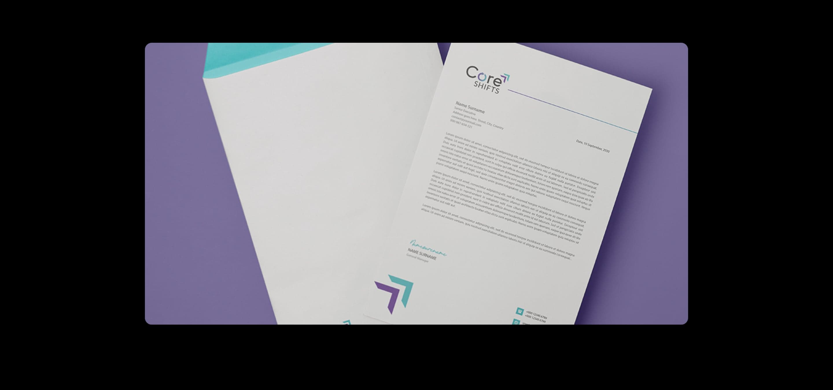
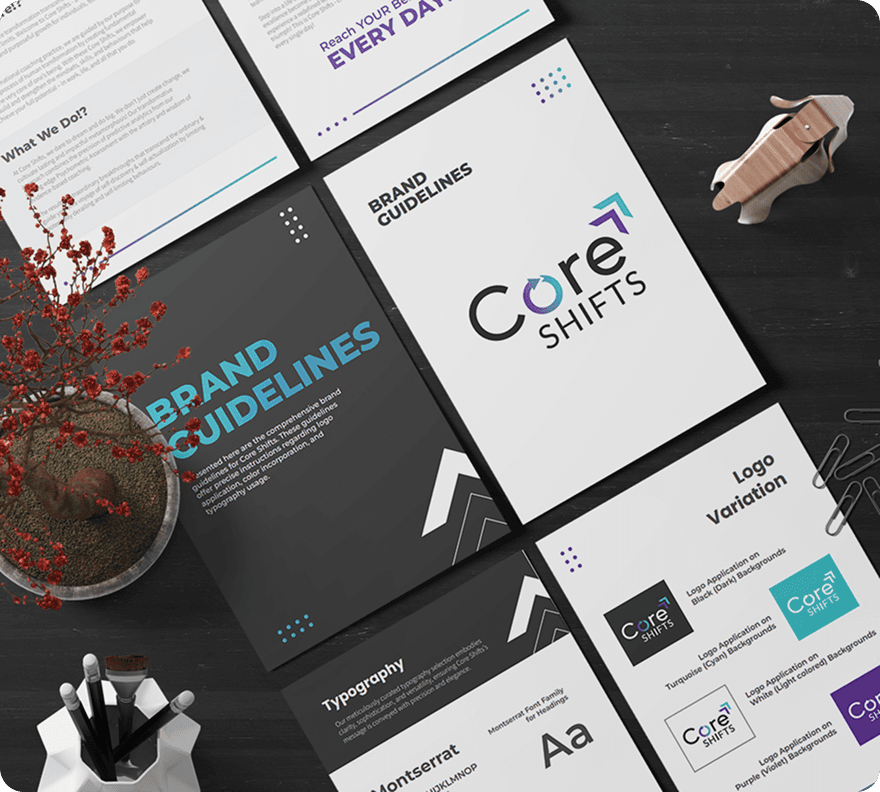
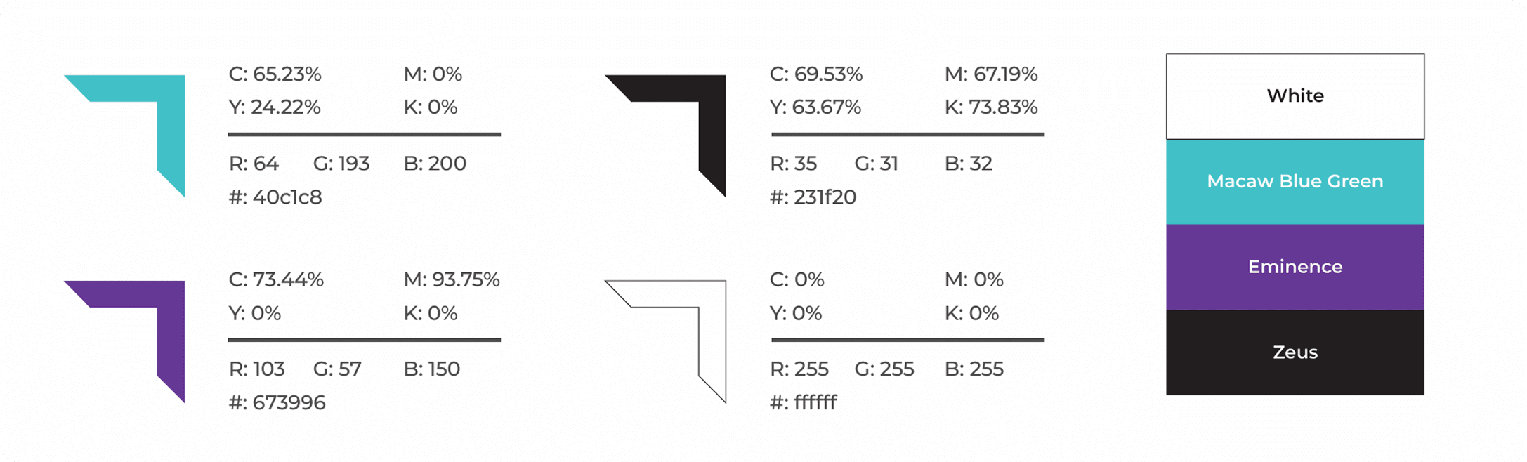
We developed a refined visual identity that reflected the practice's professionalism and established a complete brand structure to maintain consistency across all digital and offline touchpoints.

Clarity-Led Website Information Architecture
The website was restructured to focus on the user's decision-making journey, making it easy to learn about the philosophy, services, and outcomes without being overwhelmed by advanced coaching concepts.

Human-Centred Narrative and Messaging
Instead of using motivational language, the marketing emphasised clarity, insight, and structured transformation, allowing visitors to engage with the practice via understanding rather than emotion alone.

100% Mobile-First Design and Delivery
Every interaction was built with mobile consumers in mind, ensuring a consistent experience across platforms while maintaining readability, usability, and the brand's premium feel.
05
Execution
Simplicity and depth. Balanced. Built. Live in 3 weeks.
The execution phase was not about adding more. It was about removing everything that took the focus away from the business's true worth. We created a website that is calm, structured, and intuitive, allowing visitors to absorb information at their own pace without being overwhelmed with needless complexity. Coaching frameworks were reorganised into a logical path, making complex principles easier to understand while maintaining their depth. Along with the website, a comprehensive brand identity system ensuring that every interaction, from digital platforms to future marketing materials, communicated the same consistent message with confidence.
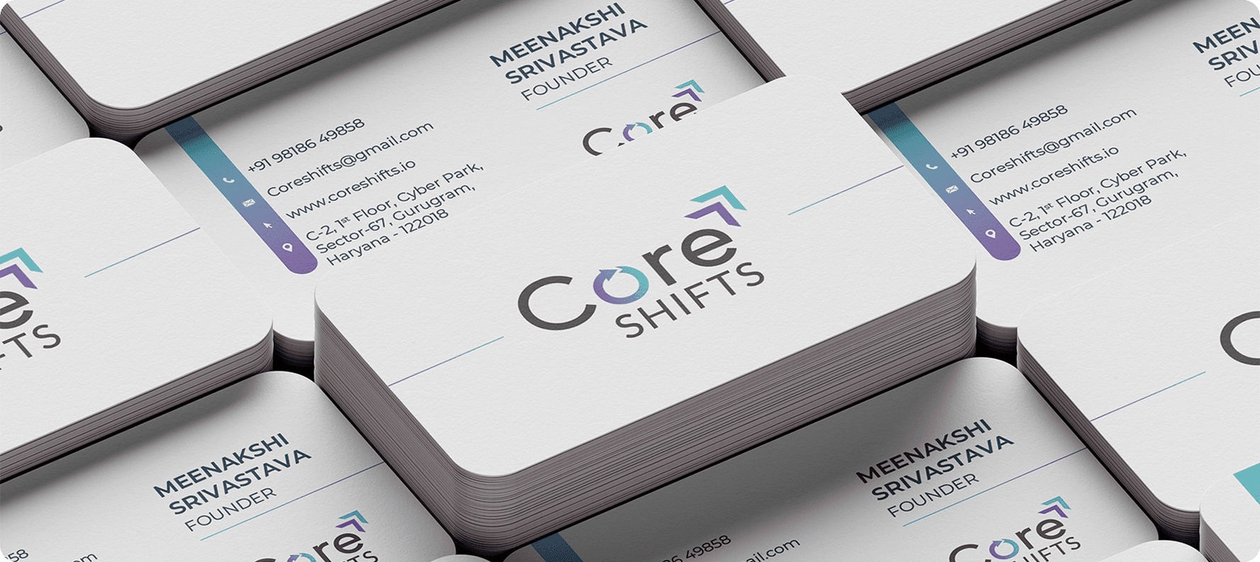

Logo Redesign
A refined logo embodied the clarity, depth, and professionalism that define the Core Shifts philosophy.

15+ Brand Assets
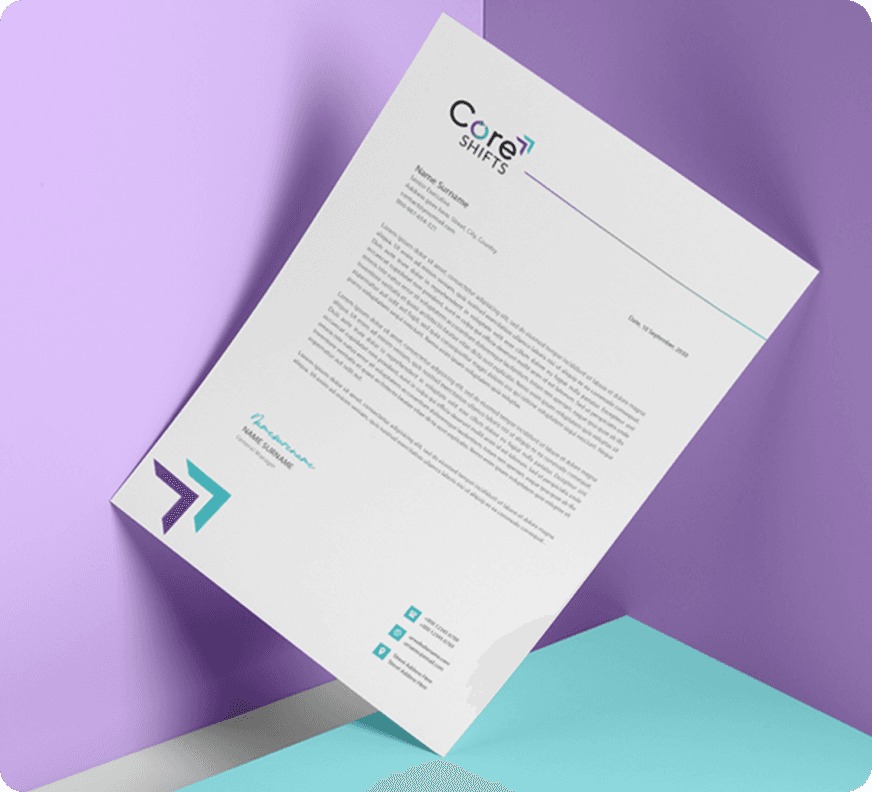
A unified visual system ensured consistency in presentations, digital assets, and future marketing collateral.

Website Design
A purposeful digital experience was designed to translate the brand identity online, creating a clear, engaging and intuitive journey for visitors.
100% Mobile-First
Every page was optimised to provide a consistent experience on mobile, tablet, and desktop devices.

Content Strategy
The content was reorganised to clarify complex coaching principles while maintaining their depth and authenticity.

WordPress Development
The website was created using WordPress, which offers flexibility, scalability, and an easy-to-use content management system.

Human-Centred UX
Every interaction prioritised understanding, ensuring visitors felt guided rather than overwhelmed throughout the journey.

Brand Consistency System
Every visual and written touchpoint was consistent with one brand identity, resulting in long-term recognition and trust.
06
Results
A brand and website that finally reflect the depth of the work.
Core Shifts' success was not defined by a big visual redesign. It was measured using alignment. The logo, website, and messaging now reflect the same traits that clients encounter during the coaching process: clarity, organisation, and purposeful transformation. Instead of expecting prospective clients to interpret complex concepts on their own, the new digital experience provides them with confidence. Every touchpoint now supports the same identity, making the practice appear more credible, approachable, and better positioned for long-term success.

A comprehensive brand strategy-maintained uniformity across presentations, marketing materials, and digital channels, ensuring that each interaction reinforced recognition and confidence.
From strategy to launch, the project proceeded quickly without compromising quality, delivering a professional digital presence within a tight three-week deadline.
Every page was created to cater to modern browsing patterns, ensuring a consistent experience across smartphones, tablets, and desktops while preserving clarity and usability.

Ecompapi helped us articulate who we are with clarity and structure. The new brand and website truly reflect the depth of our work.
What this proves
People do not invest in coaching simply because their website is visually appealing. They invest because they believe the person behind it understands their challenges and can steer them towards significant change. That belief originates well before the first conversation. For Core Shifts, the most significant transition was not the creation of a new logo or website. It made the invisible visible. The clarity of the technique, depth of thinking, and professionalism of the practice are now apparent in every engagement. This project reveals how the most powerful brands don't always say more. They communicate better. When strategy, storytelling and design work together, complexity becomes clarity, trust grows naturally, and the right clients recognise your value before you ever meet them.
What our clients have to say
The best way to understand how we work is through the people we've worked with. Hear their stories, experiences and the impact we've created together.
Other Case Studies

Cella Architects
Ecompapi collaborated with Cella Architects to enhance its digital presence and engage its audience through thoughtful design and content. Our UI/UX professionals created interfaces that ensured ...


Sabco Electricals
Lorem ipsum dolor sit amet, consectetur adipiscing elit. Sed do eiusmod tempor incididunt ut labore et dolore magna aliqua. Lorem ipsum dolor sit amet, consectetur adipiscing elit